Accounting, Payroll and Custom Software
PayrollNewLook
New look for Winledge Payroll, Corporate and Professional editions
At Classic, our primary focus is always to improve the customer experience with our software. Recently our customers have been asking for improvements to the user interface of the Winledge Payroll Professional and Winledge Payroll Corporate Editions. Specifically on larger monitors with higher resolution some users are finding it more difficult to view the text and images in the software. As a result of this feedback we have made the following changes:
One – Font change
We have increased the font size throughout the software from 8 points to 10 points. In order to do this, the position of some text was moved and some of the prompts and buttons have been enlarged. We have also changed the default font from MS-Sans-Serif to Tahoma.
Two – Higher Contrast
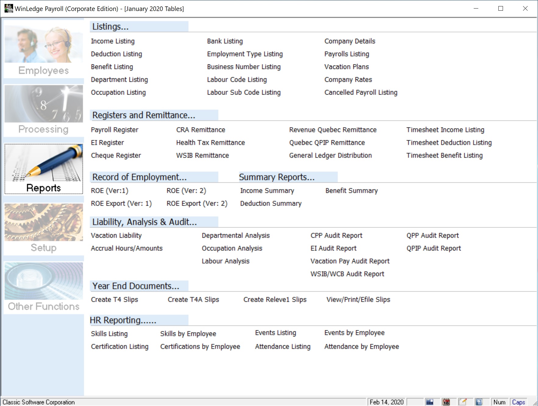
We have revised the menu system to a higher contrast font (Black on white) and have enlarged the font for the headings.
We have also revised the pictures and text on the main menu items.
This is the result…
Windows 10 Users
Lastly if you are running Windows 10 there is a new option to improve the font even further. Here is how you can tweak the look...
Step One
Right click on the icon you use to start the Payroll, then select “properties”
Step Two
On the properties page click on the “compatibility” tab.
Step Three
On the compatibility tab, click on the “change high DPI settings” button.
Step Four
Check off the Override High DPI box and then choose “System (Enhanced)”
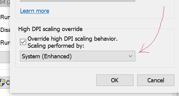
Step Five
Click on OK, Click on Apply and Click on OK.
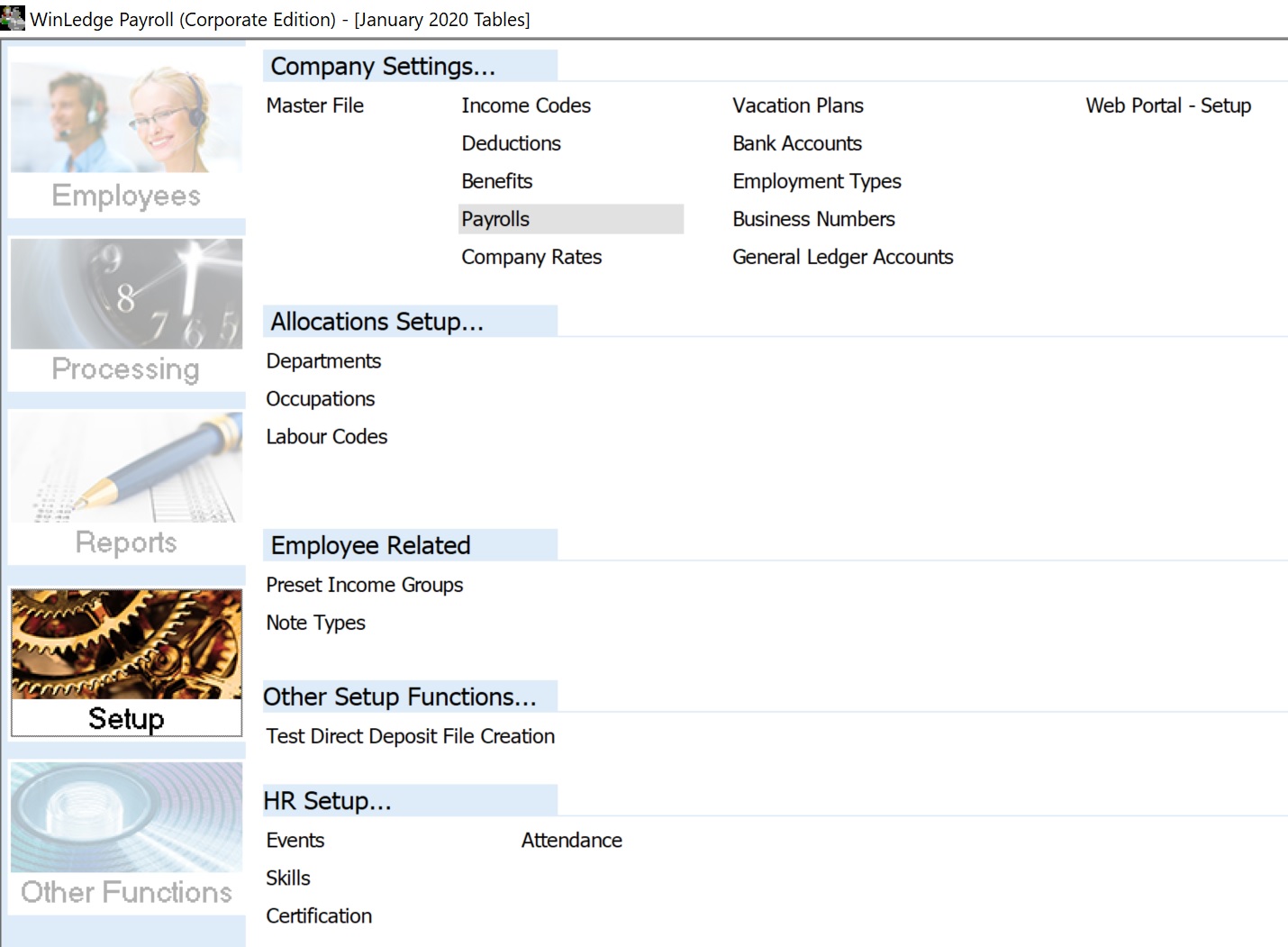
The software should now look something like this…
Once again, we would like to thank our customers for the feedback that led to this feature.
Please do not hesitate to contact us at anytime with ideas for improvements to the software.
Please use the link below to pass them along…
Contact
Thank you from the Classic Software development group.